shelter
WHAT
Branding
WHEN
July 2026
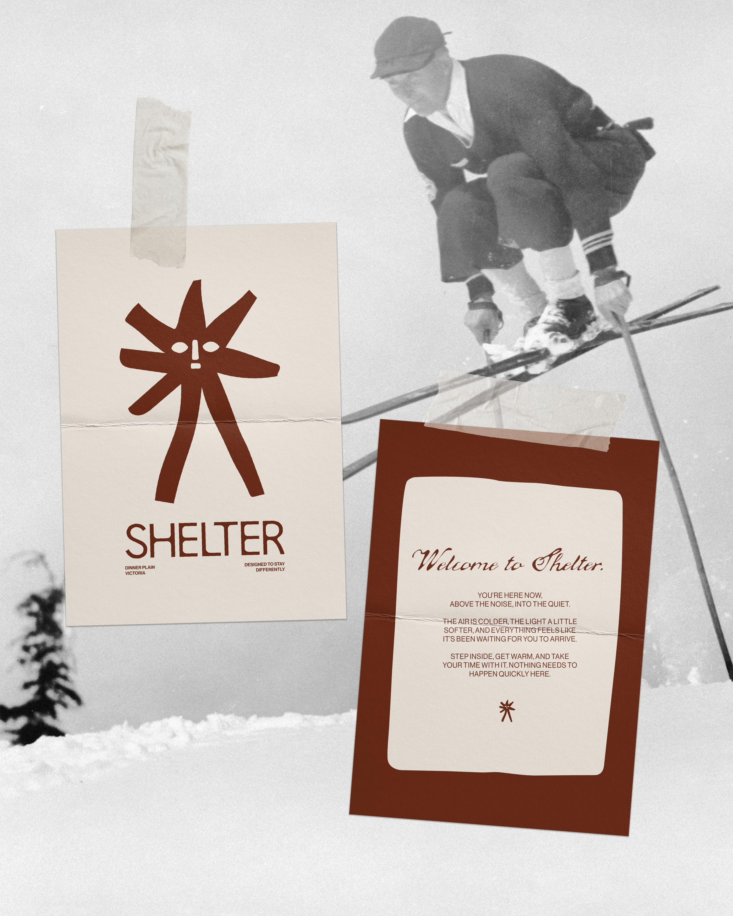
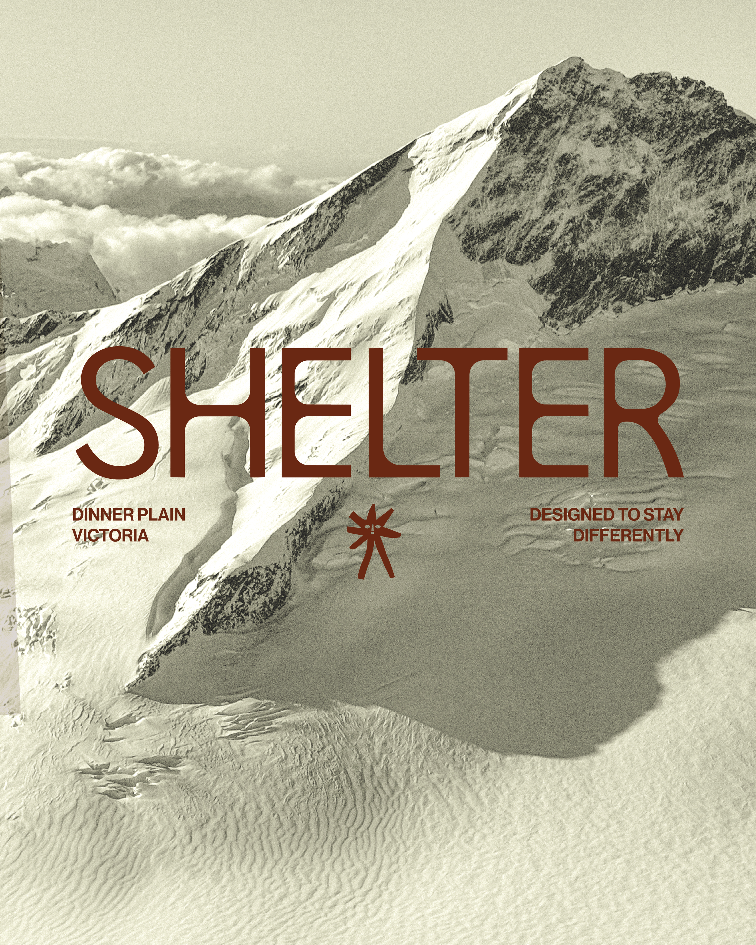
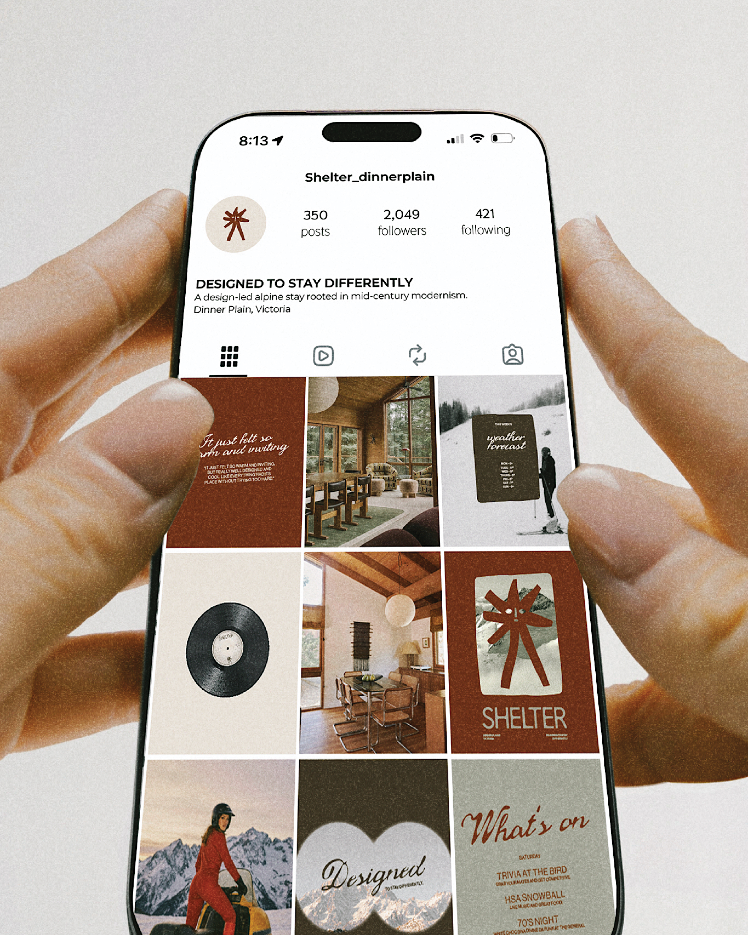
We’re taking it back to the mid-century. Rather than leaning into the usual alpine hospitality clichés, we wanted Shelter to feel warmer, more nostalgic and a little more considered. The identity combines a mid-century inspired wordmark, natural alpine tones, generous negative space and a seasonal symbol that gives the brand personality without overdoing it.
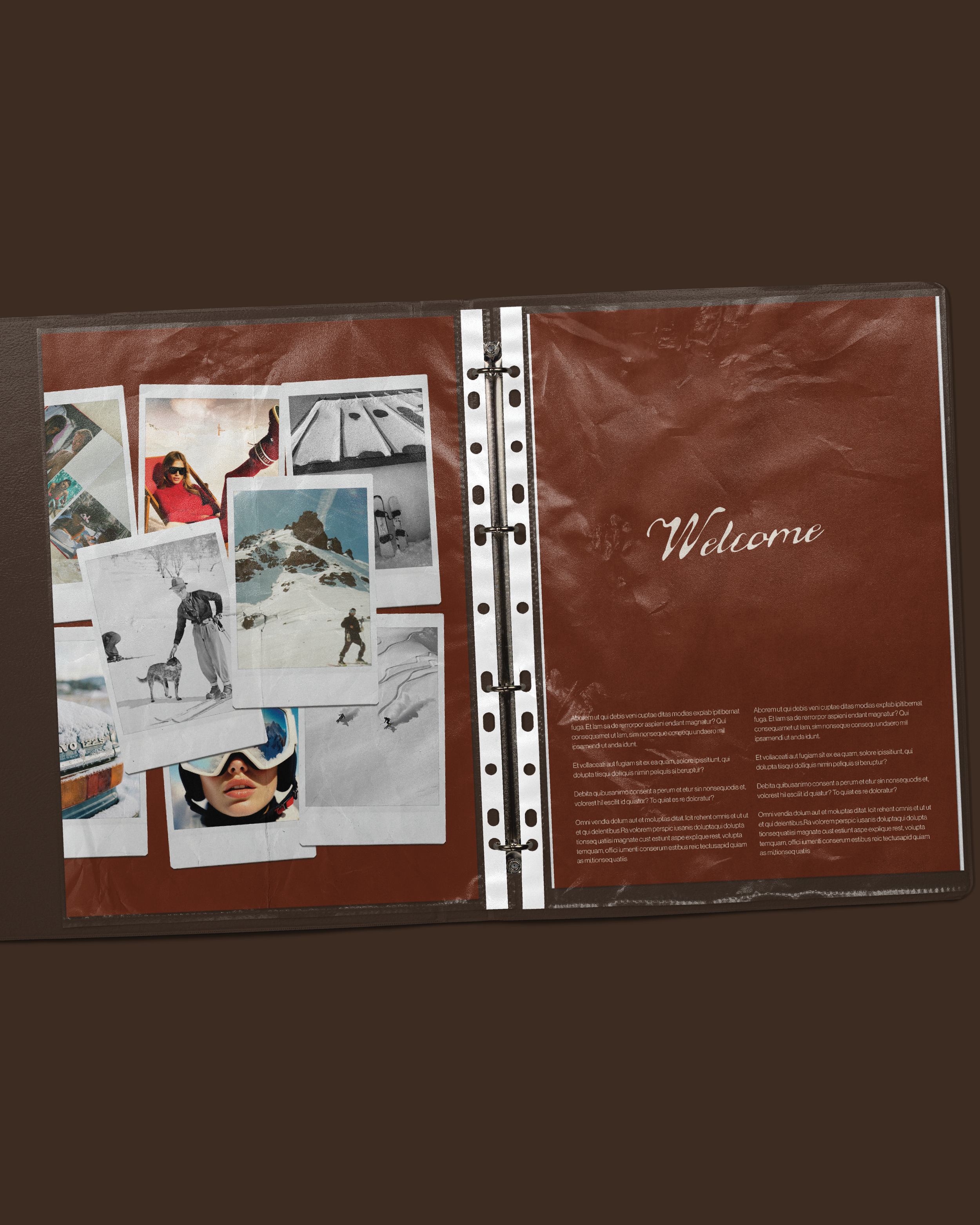
The visual direction takes an editorial approach to alpine hospitality. Warm neutrals, muted sage, earthy browns, burnt rusts and soft off-whites draw from the landscape, while structured typography and considered layouts give the brand a more contemporary, lifestyle-led feel. The result is warm, inviting and a little bit cultured, without looking like every other mountain stay.
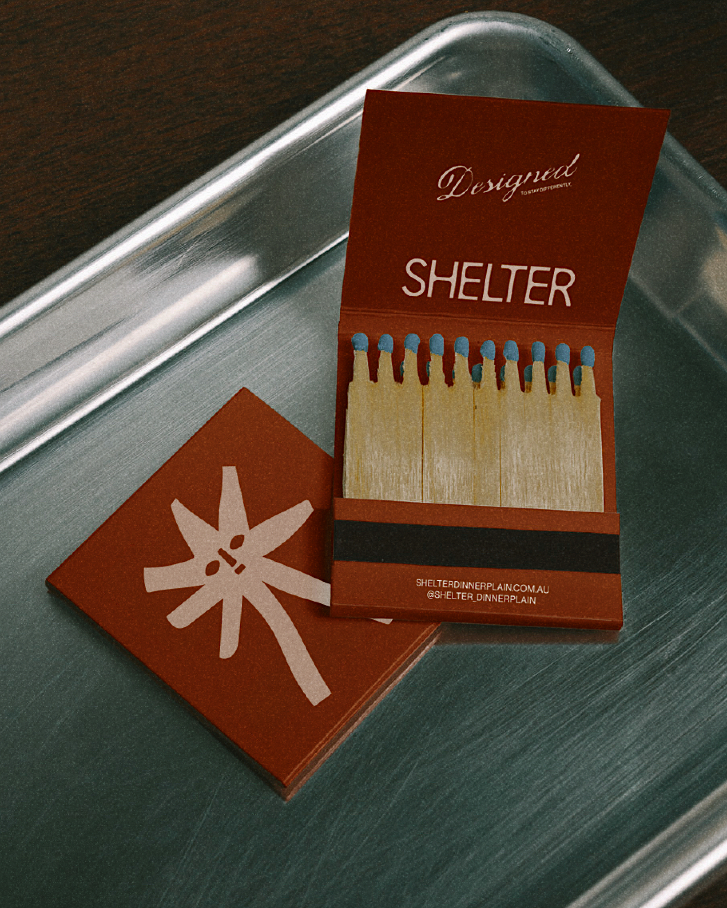
One of our favourite details is the seasonal brand mark. In winter, it becomes an abstract snowflake, while in summer it transforms into a sun. There’s also a subtle face hidden within the form, adding a little personality for those who take a closer look. Simple, recognisable and deliberately understated, the mark gives the identity a sense of movement throughout the year.
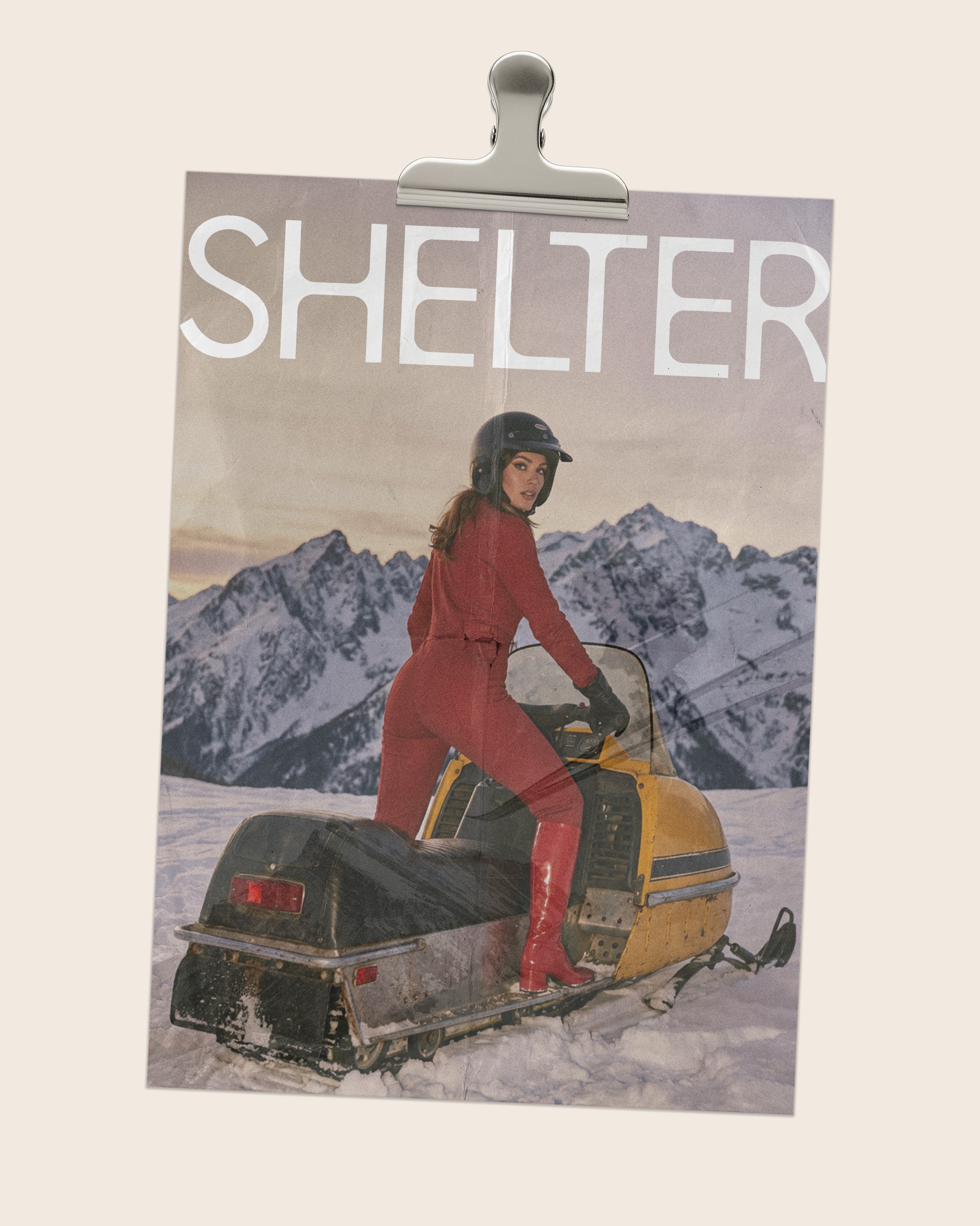
For us, hospitality branding is about creating a feeling before someone even walks through the door. Every detail of Shelter’s identity has been designed to do just that, from the architectural wordmark and evolving symbol to the restrained typography and tactile alpine palette.
Shelter is luxury through restraint. An alpine experience with personality, wrapped up in a brand that knows exactly what it wants to say.